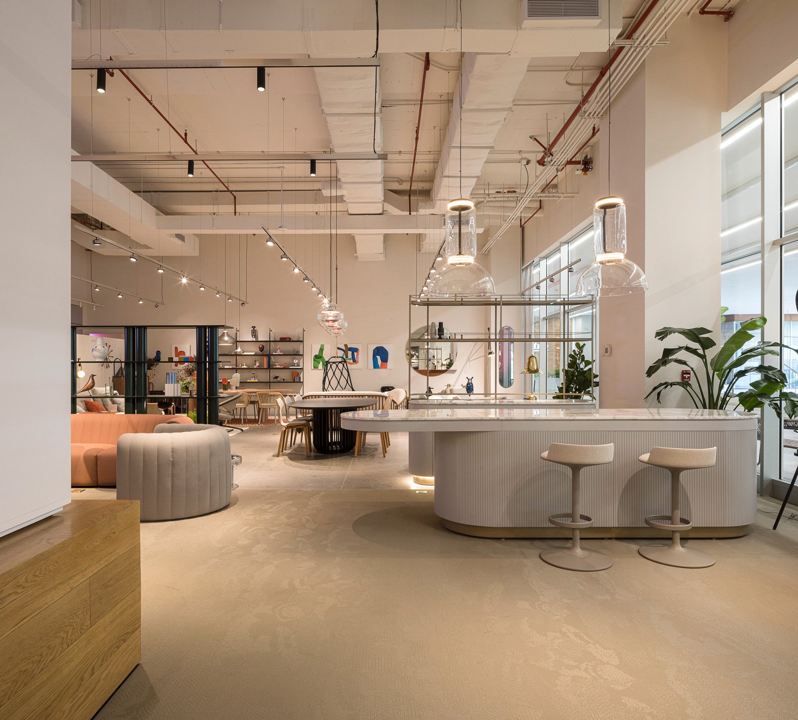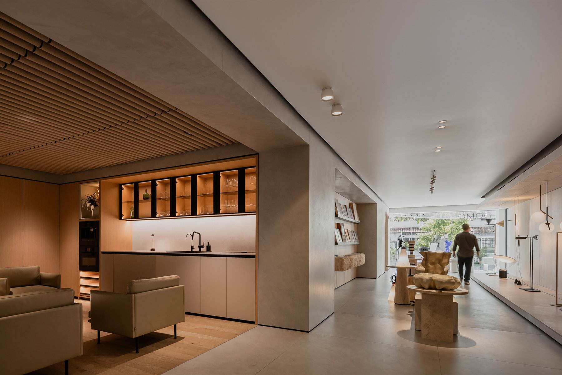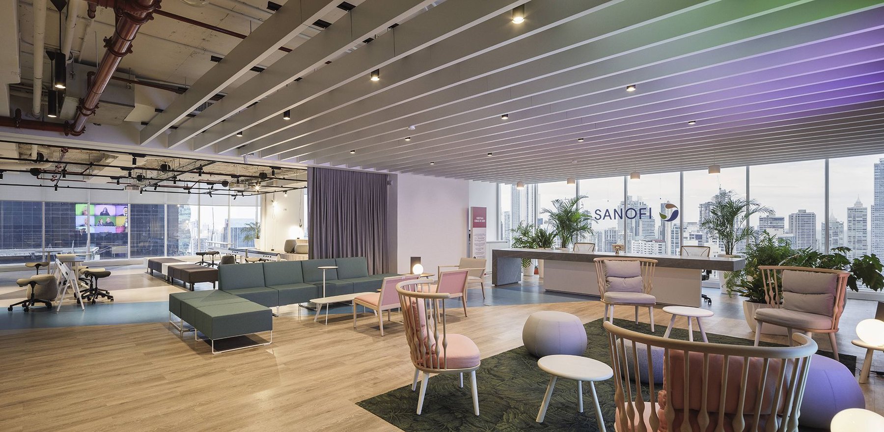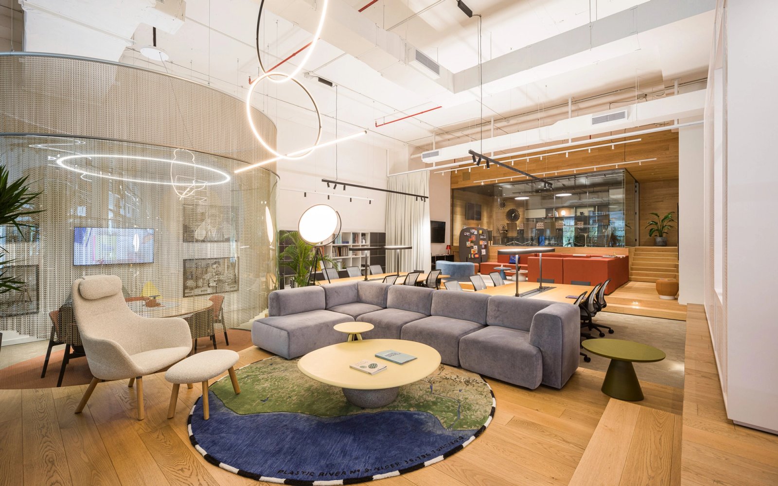
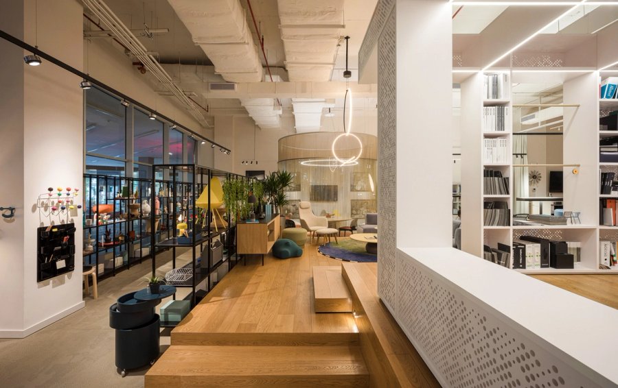
User experience and navigation within the space were paramount considerations throughout the project. Thus, areas for lingering and various uses within the showroom were strategically organized, employing platforms to lend hierarchy, privacy to work zones, and diverse visual perspectives to the interior.
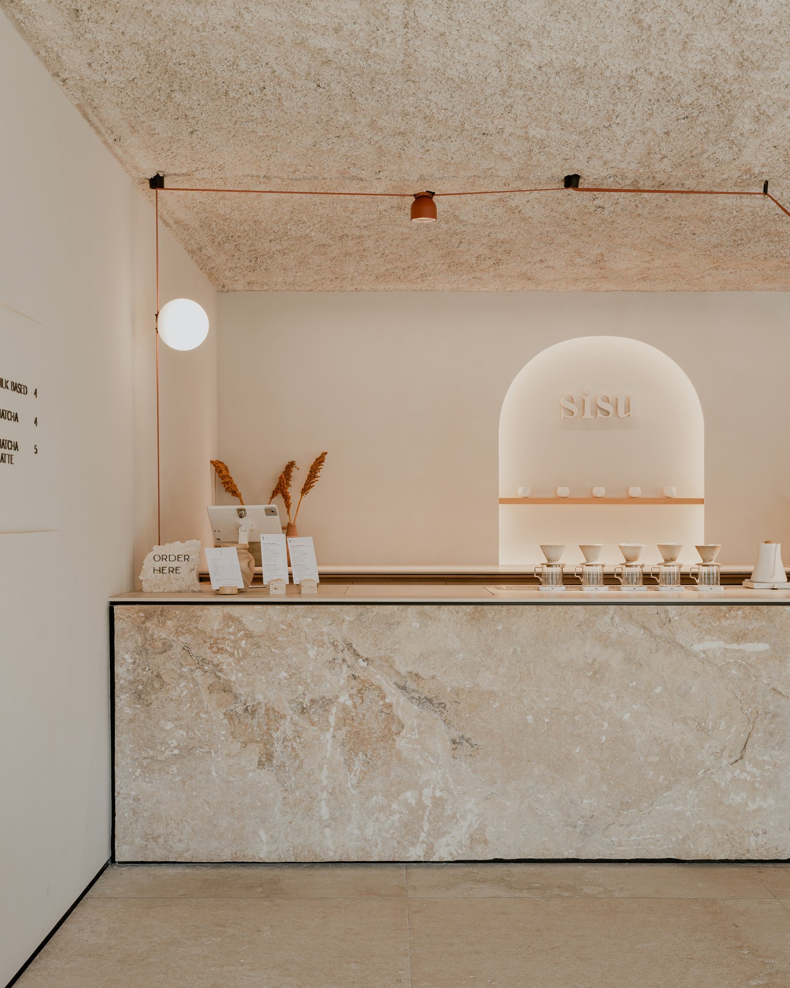
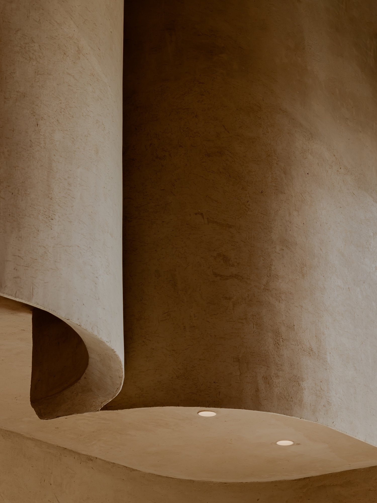
Materiality plays a pivotal role in defining spaces and accentuating the displayed products.
Diverse textures and tones within the same color palette, inspired by the brand's chromatic identity, create a dynamic visual landscape.
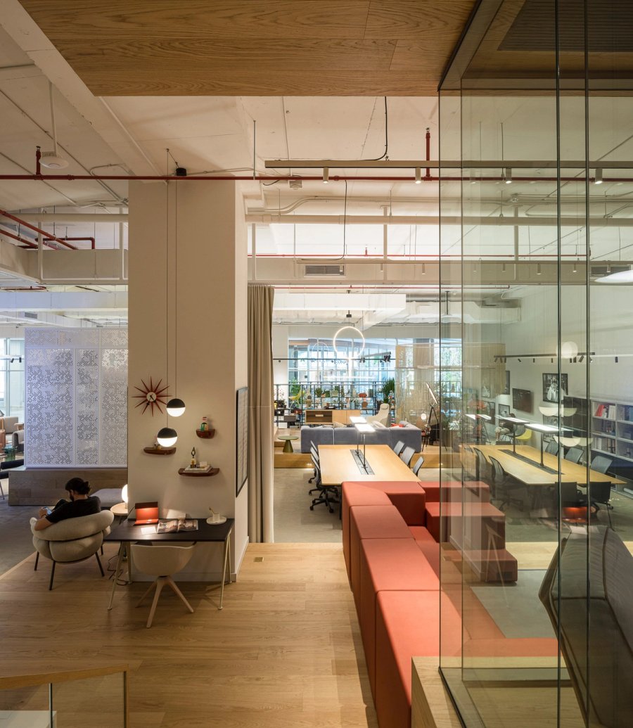
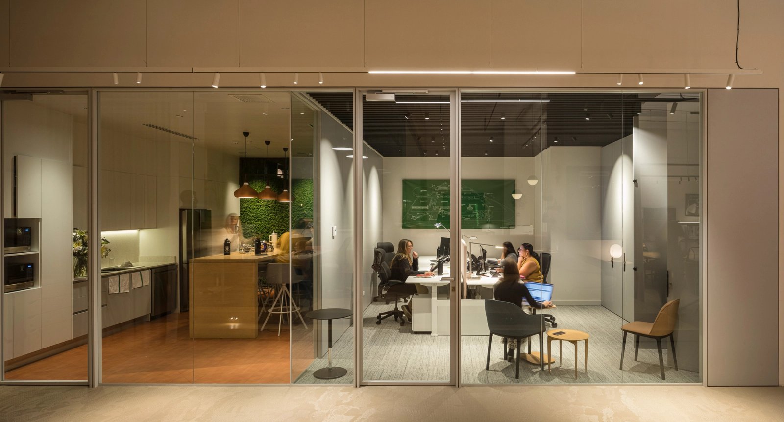
Considering the office's work typology, different meeting rooms and client service areas are crafted, each designed to be both functional and distinctive.
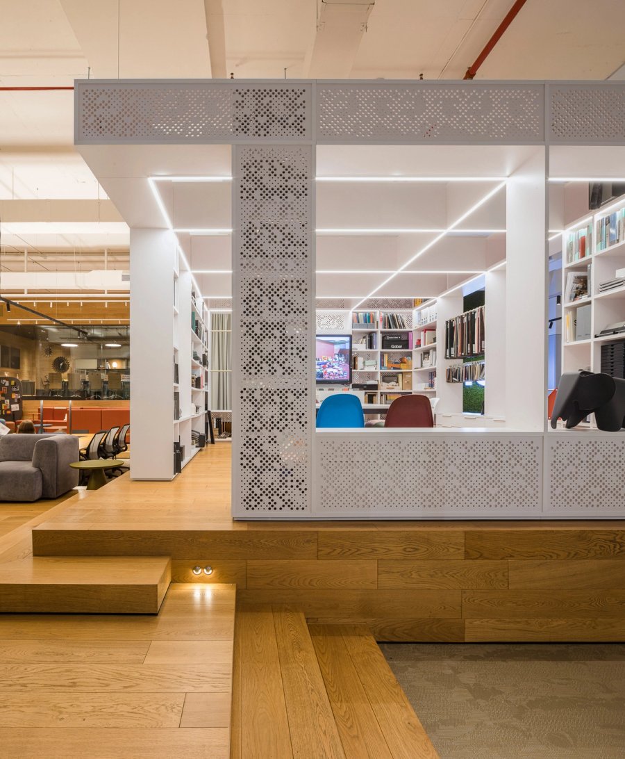
The central sample room, serving as the heart of the project, houses catalogs and samples used in the firm's day-to-day operations. It acts as a visual barrier between the residential showroom area and the work and concentration zones, clearly delineating spaces based on privacy levels and transparency.
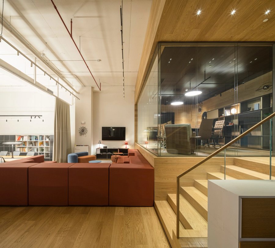
The design culminates in a highly flexible, utilitarian, and comfortable space for its users, fostering nomadic work styles across various environments that encourage collaboration and streamline creativity.
